The Man Behind the FedEx Logo

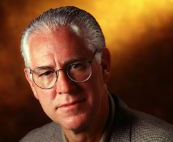
Not long ago, I posted about the subliminal arrow in the FedEx logo. I received several emails regarding it, including one from design student Bobby Dragulescu. Thanks to Bobby and his typography professor Leah Hoffmitz, I was put in touch with the logo's creator: Mr. Lindon Leader of Leader Creative.

Lindon kindly agreed to the following interview, which is comprised of 8 fairly intelligent questions, and 3 fairly dopey ones...

When did you design the logo?
1994, as Senior Design Director at Landor Associates, San Francisco.
Has the logo won many awards?
To my knowledge, over forty worldwide and they continue. In its May 15, 2003 35th Anniversary �American Icon� issue, Rolling Stone Magazine ranked it as one of the 8 best logos of the past thirty-five years. Along side Apple, Coca-Cola, Nike, IBM, Starbucks, McDonald�s and Playboy.
Is this the most �famous� logo you have designed?
In terms of sheer ubiquity, absolutely. Though the logos for Ryder trucks, CIGNA, the NCAA and Latin America�s largest bank, Banco Bradesco (Sao Paulo, Brazil) are familiar in their own right.
Do you get free FedEx deliveries for life now?
I wish. But I did get a once-in-a-lifetime opportunity to command an MD-11 flight simulator at the Memphis hub. Unfortunately, I crashed the plane into the sand dunes at LAX on approach from Hong Kong. Nobody hurt, though.
At what point in the design process did you realize you could create an arrow with those letters?
First of all, by the time we�d gotten to this point we�d already created and reviewed over 200 designs; some close-in to the �old� Federal Express logo and others progressively more daring (though all the while retaining the enormous cache of the famous orange and purple (despite the fact that many respondents in focus groups thought the Federal Express colors were �red and blue�). The current design was one of six semifinalists that were being refined for a presentation to very senior management.
If you put a lower-case �x� to the right of a capital �E� (Ex) you can begin to see a hint of an arrow, though it is clumsy and extremely abstract. I thought that, if I could develop this concept of an �arrow� it could be promoted as a symbol for speed and precision, both FedEx communicative attributes. And, by the way, different kinds of arrows were utilized with some of the other semi-final candidates, though none of those were �hidden.�
Once I decided to refine the concept of the embedded arrow, I found that, to make the arrow more legitimate and identifiable, one needed to actually reconstruct the letterforms in order to make the arrow happen. This leads to your next question:
Did you have to manipulate the font in anyway to create a perfect arrow?
Yes, indeed. I was studying Univers 67 (Bold Condensed) and Futura Bold, both wonderful faces. But each had its potential limitations downstream in application to thousands of FedEx media, from waybills and embroidered courier caps to FedEx.com and massive signage for aircraft, buildings and vehicles. Moreover, neither was particularly suited to forcing an arrow into its assigned parking place without torturing the beautifully crafted letterforms of the respective faces. To avoid getting too technical here, suffice it to say I took the best characteristics of both and combined them into unique and proprietary letterforms that included both ligatures (connected letters) and a higher �x-height,� or increased size of the lower-case letters relative to the capital letters. I worked these features around until the arrow seemed quite natural in shape and location.
Why choose to keep the arrow so subtle? It seems to show remarkable restraint. Weren't you or the people at FedEx ever tempted to make it more obvious with an outline or a different color?
A good question and one that I am frequently asked. An arrow, in and of itself, is one of the most mundane graphic devices in visual communications. Truly, there is nothing unique or particularly strategic (marketing-wise) in using an arrow as a brand identifier. Early on, before the brand rollout in mid-1994, FedEx�s public relations agency was preparing to emphasize the arrow as a secondary graphic to underscore the �speed/precision� positioning. They proposed to leverage this in their FedEx communications. Landor put its foot down and said, �No way.�
The power of the hidden arrow is simply that it is a �hidden bonus.� It is a positive-reverse optical kind of thing: either you see it or you don�t. Importantly, not �getting the punch line� by not seeing the arrow, does not reduce the impact of the logo�s essential communication. The power of the logo and the FedEx marketing supporting the logo is strong enough to convey clearly FedEx brand positioning. On the other hand, if you do see the arrow, or someone points it out to you, you won�t forget it. I can�t tell you how many people have told me how much fun they have asking others �if they can spot �something� in the logo.� To have filled in the arrow, or to somehow make it more �visible� would have been like Henny Youngman saying �Please take my wife� instead of �Take my wife. Please.� Punch lines that need to be explained are neither funny nor memorable.
Is there anything else interesting about the creation of the logo that you can remember?
Well, in �selling� an identity into a company it always comes down to the CEO. Fred Smith is a marketing genius and understands the vital role of design in brand building. A smart, intuitive man. After a year of worldwide focus groups and brand strategy revitalization, Mr. Smith accepted the strategy to change the communicative name of the company from Federal Express to FedEx for a whole host of reasons I won�t get into here.
In authorizing us to commence the next phase of developing a graphic identity for this �new� name, he sent us off with these charges: 1), �If you come back and tell me our colors need to be pink and green just give me very good reason to do it and 2), �If I�m standing on a street corner, I need to see a FedEx truck from five blocks away.� Meaning that the brand expression needed to be large, impactful and differentiating, which was accomplished with this specific design system, one of five presented to Mr. Smith and his executive team on April 23, 1994 in Memphis. And, in the process, we made the orange more orange and the purple less blue.
What separated this candidate from the others? Among other reasons,
Mr. Smith was the only executive in a room of 12 that spotted the arrow right away.
Are you like a rock star in the world of logo design now?
Well, we Fortune 1000 identity guys and gals are behind the scenes most of the time. We do get our individual recognition from design competitions, but generally speaking, the design public only hears of the branding firm that created the design; in this case, Landor Associates. And the public at large doesn�t know who designs something or even cares to know. So, these days you won�t find me ducking crowds screaming for my autograph. No.
Have you ever been asked to autograph a FedEx truck?
I�ve never been able to find a Magic Marker big enough for the job. But I have signed FedEx letter envelopes and boxes. And, of course, my autograph is on my monthly check to FedEx.
What's it like to see something you came up with, all over the place?
Fabulous. And very gratifying. It takes me back to my very first employer out of Art Center in Pasadena, the renown Los Angeles designer Saul Bass. Toward the end of his career in 1980 or so, an interviewer asked him if still got out a thrill out of it all after some 40 years and a million awards in the corporate identity and film industries. Saul said he had been in a car one day recently with his 5 year-old daughter who exclaimed, �Look Daddy! There goes one of your [AT&T] trucks!� And Saul said to the interviewer, �You know, seeing that truck coming down the road still makes me proud after all these years.�
You can visit the website of Leader Creative right here.
http://www.thesneeze.com/mt-archives/000273.php
